 Contact Us
 My Account
 Basket

Colours play a crucial role in design, branding, and printing. But how do designers and businesses ensure their colours remain consistent across different materials and mediums?
That’s where Pantone comes in. When it comes to achieving precise and consistent colours in printing, the Pantone Matching System (PMS) is a vital tool for designers and manufacturers. This system ensures that colours remain uniform across various materials and production processes.
But you may be wondering what is Pantone, well let’s quickly dive deeper into the insights of the topic;
What Does Pantone Mean?
Simply put, Pantone is a globally recognised colour-matching system used across industries like graphic design, fashion, and printing. The Pantone Matching System (PMS) standardises colours, ensuring they appear the same no matter where or how they are printed.
Instead of mixing inks during printing (as with CMYK), what is colour Pantone really about?
It uses pre-mixed spot colours, guaranteeing precise colour consistency. This is especially useful for branding, as companies need their logos and materials to look identical every time.
What Is Color Pantone?
The term Pantone comes from the company Pantone LLC, which developed the Pantone Matching System (PMS) in the 1960s. Today, Pantone is the universal standard for colour identification, ensuring uniformity across different industries.
What Is a PMS Colour?
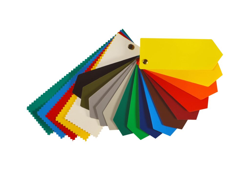
A PMS colour (Pantone Matching System colour) is a pre-mixed ink shade assigned a unique identification number. Unlike CMYK, which blends four ink colours to create different shades, PMS colours are precisely formulated to appear the same on all print materials.
The Pantone Matching System is a standardised colour-matching system that identifies nearly 5,000 subtle colour shades and variations.
This detailed numbering system allows designers and printing manufacturers to standardise and match colours accurately, overcoming common variations that can occur with other colour models.
Why Use PMS Colours?
✔ Brand Consistency: Ensures logos, packaging, and corporate materials match perfectly.
✔ Vibrant & Unique Shades: Includes speciality colours like metallics and neons.
✔ Colour Accuracy: No variations across different printers or materials.
For example, Coca-Cola Red (Pantone 484) is a registered PMS colour, ensuring its red looks identical worldwide and has been soaring the top chart in the best business card printing colour selection.
What Is the Pantone Colour of the Year?
Every year, Pantone selects a Pantone Colour of the Year, influencing design, fashion, and branding trends. This colour reflects global cultural and design influences, shaping trends across various industries.
Pantone Colour of the Year 2025
The Pantone Colour of the Year 2025 is PANTONE 17-1230 Mocha Mousse, a warm and earthy brown symbolising stability and sophistication.
How Does PMS Differ from Other Colour Models?
Unlike CMYK, which combines cyan, magenta, yellow, and black inks to produce various hues, PMS uses pre-mixed, specific ink formulations to achieve exact colours. This method ensures consistency across different print runs and materials.
For businesses looking to print high-quality presentation folders, PMS colours offer the most reliable and accurate colour representation.
This method eliminates discrepancies that can arise from mixing inks during the printing process, ensuring consistency across different print runs and materials.
| Feature | Pantone (PMS) | CMYK | RGB |
| Colour Accuracy | High – exact colour matching | Medium – some colour shifts | Low – varies across screens |
| Best For | Branding, logos, packaging | Brochures, posters, general printing | Digital screens, websites, social media |
| Consistency | Always the same, regardless of material | Can vary between printers and substrates | Changes depending on screen settings |
| Colour Range | Limited but precise | Wide range but less accurate | Millions of colours available |
| Printing Process | Uses pre-mixed ink | Created by blending four inks (cyan, magenta, yellow, black) | Uses light to display colours |
| Cost | More expensive due to pre-mixed inks | Cost-effective for bulk printing | No printing costs (for digital use) |
| Vibrancy | Can include metallics, neons, and special shades | Some bright colours are difficult to reproduce | High vibrancy on screens but not printable as-is |
| Flexibility | Ideal for precise branding but limited in shades | Great for full-colour images and gradients | Best for interactive and digital designs |
| Used In | Business cards, packaging, luxury prints, corporate branding | Magazines, flyers, presentation folders, posters | Websites, apps, digital advertisements |
Finally, Why does Pantone matter?
Pantone plays a vital role in ensuring colour consistency and accuracy across different industries. Whether you’re designing a brand logo or staying on top of the latest Pantone Colour of the Year, understanding PMS colours helps create impactful and visually stunning designs.
Need help choosing the right colours for your next print project? Consult a professional printer to ensure your colours match your vision perfectly!


