 Contact Us
 My Account
 Basket

In the world of print marketing, understanding the difference between RGB and CMYK is crucial for creating vibrant, accurate designs. Whether you’re ordering raffle ticket printing, the right colour mode ensures that your designs look as vibrant in print as they do on screen.
For invitation printing, knowing when to use RGB or CMYK can help ensure the colours on your printed invitations match your expectations, maintaining the quality and impact of your design.
Let’s first clear out the long list of questions and doubts on RGB vs CMYK;
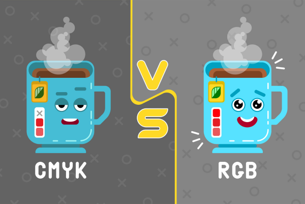
What is RGB?
RGB stands for Red, Green and Blue, and is primarily used for digital displays like monitors, phones and TV screens. This colour mode combines red, green and blue light to create a wide array of colours. When designing for digital platforms, RGB colours are the go-to.
However, using RGB for printed materials often leads to disappointing results, as printers use a different colour model altogether. Perhaps the Key takeaway is that RGB is best for screen displays, not for printing. For more details about RGB and its role in digital design, check out our article: Printing: What Does RGB Stand For?
Moving ahead;
What is CMYK?
CMYK stands for Cyan, Magenta, Yellow and Key (Black) and is the colour mode used for most printing processes. When you’re creating designs for anything that will be physically printed—be it a brochure, poster or custom raffle tickets—you should always design in CMYK.
Unlike the RGB model, which adds light to create colour, CMYK subtracts light, blending inks or pigments to create the hues on the printed surface. This is why a design that looks bright and vivid on your computer screen (in RGB) might appear dull or washed out when printed unless it has been converted to CMYK.
Here the end point is that CMYK is essential for high-quality print results. The end point is that CMYK is essential for high-quality print results. For creative ways to print on unique materials, check out this blog.
RGB vs CMYK for Print Marketing
When deciding between RGB or CMYK for print, always opt for CMYK to guarantee accurate colour reproduction. Designing in RGB for print can cause unwanted colour shifts and inconsistencies, especially when printing materials like raffle tickets, posters or brochures.
Why You Should Choose CMYK for Print
- Accurate colour matching: CMYK ensures the colours in your design appear correctly on paper.
- Professional finish: Whether you’re printing for corporate events or charity fundraisers, using CMYK results in a polished, high-quality product.
- Consistent results: Unlike RGB, which can vary on different screens, CMYK offers consistency across various print runs.
How to Choose Between RGB and CMYK
- RGB for Digital: If your design is meant for screens, social media, or websites, go with RGB. The vibrant colours will pop on electronic displays.
- CMYK for Print: When creating physical materials, use CMYK to ensure the colours come out exactly as planned on the printed product.
Final Thoughts
The difference between RGB and CMYK might seem small but can have a significant impact on the final look of your printed marketing materials. To avoid colour discrepancies and to create a professional finish for items such as raffle ticket printing or invitation printing, always convert your files to CMYK before sending them to print.
Boost your print marketing efforts by understanding the importance of choosing the right colour mode for your designs, ensuring your printed materials not only meet but exceed your expectations.


