 Contact Us
 My Account
 Basket

When it comes to printing, choosing the right colour system is like picking the perfect outfit for an event CMYK is your versatile everyday wardrobe, while Pantone is the custom-tailored suit that turns heads. Both have their unique flair, but which one suits your project best? Let’s dive into the colourful world of CMYK and Pantone to help you decide!
CMYK and Pantone: Which One Is Right for Your Printing Needs?
When it comes to printing, colour consistency and vibrancy play a crucial role in achieving a high-quality result. Two of the most commonly used colour systems in printing are CMYK (Cyan, Magenta, Yellow, Black) and Pantone. While both serve distinct purposes, understanding their differences can help you make an informed choice for your next print project.
What Is CMYK?
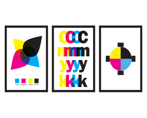
CMYK is a four-colour process used in most printing methods. Each Colour is built by layering varying amounts of the four primary inks cyan, magenta, yellow, and black.
This method allows for a wide Colour gamut and is ideal for digital or offset printing. Images or designs using CMYK can include millions of Colour combinations, making it cost-effective and versatile. However, certain vibrant Colours or specific shades are challenging to reproduce with CMYK, leading to slight inconsistencies.
What Is Pantone?
The Pantone Matching System (PMS) is a standardized Colour system that uses spot Colours. Pantone Colours are mixed using 14 base pigments, much like creating paint from a precise recipe. Each Colour is pre-mixed, which eliminates any variations and ensures consistency across different printing runs or materials.
For example, brands like Coca-Cola use Pantone to achieve their exact shade of red every time, no matter where or how it’s printed.
CMYK vs. Pantone: Pros and Cons
| CMYK | Pantone |
| Cost-effective for high-volume printing | Provides exact Colour matching |
| Wide Colour range, but less precise | Ideal for brand-specific, unique Colours |
| Suitable for digital and general prints | Higher cost and longer lead times |
For example, brochure printing or die cut flyers can usually be produced using CMYK due to the variety of colours needed, while a Pantone system might be better suited for a logo that requires exact colour matching.
Converting CMYK to Pantone
Converting CMYK to Pantone can help ensure colour consistency, but an exact match isn’t always possible due to differences in the two systems. CMYK uses a mix of four inks, while Pantone relies on specific ink formulations for precise colours. Using a Pantone colour guide, digital tool, or Pantone to CMYK converter can help find the closest match, but vibrant or metallic CMYK colours may not convert perfectly.
For critical projects, request physical proof or consult a print professional to ensure accuracy. While conversion is possible, careful testing is often needed to achieve the best results.
If you’re considering switching between systems, you can request proof to preview how the converted colours will appear before finalising your order.
Why Colour Accuracy Matters in the UK?
A recent study revealed that 85% of UK consumers associate consistent brand colours with trustworthiness and professionalism. This makes selecting the right colour system vital for maintaining brand integrity, especially in marketing materials like brochures or flyers.
Which System Should You Choose?
The choice between Pantone and CMYK depends on your project’s needs. For most marketing materials, CMYK is sufficient due to its affordability and broad colour range. However, for projects where colour precision is non-negotiable such as logos or corporate branding Pantone may be the best option.
If you’re unsure about the right choice, consulting with a professional printer can help ensure your materials align with your vision.
Conclusion
Both CMYK and Pantone systems have unique strengths and applications. While CMYK offers versatility and cost-efficiency, Pantone ensures unparalleled colour accuracy. Whether you’re printing brochures or die cut flyers, choosing the right system will depend on your brand’s priorities and the nature of your project.
For expert guidance on colour matching and printing, feel free to get in touch with a professional print service.


